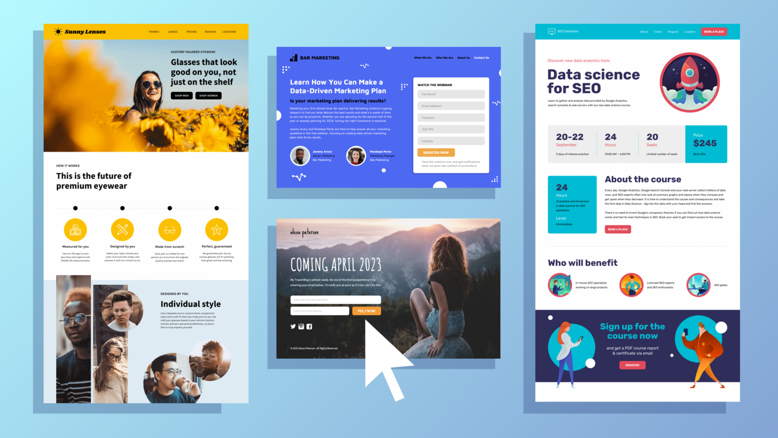
After launching over 600 landing pages across 120 niches, I’ve discovered the 11 most powerful strategies to help you get more leads and sales from your landing pages. These aren’t just theoretical tips — I’ve used these strategies to make millions of dollars in my own agency and have helped billion-dollar brands like Linktree create high-converting landing pages.
Today, I’m sharing these 11 proven tricks, complete with real examples, so you can copy and paste them into your own marketing efforts. Let’s dive in.
Trick #1: Give Your Landing Page an Eyebrow
An eyebrow is the first line of text above your headline. It immediately tells the visitor whether the page is for them. The goal is to answer their burning question right away.
Example: For a client in the wealth management space, the eyebrow reads, “Is $1 million enough to retire in Australia in 2024?” This speaks directly to the target market’s main concern, making them feel like they’re in the right place.
Another example is for a property investment client where the eyebrow says, “Looking to invest in property this year?” This resonates with the visitor’s intent and gets them to think, Yes, this is for me.
Trick #2: Give Your Landing Page a Voice
Would you trust a faceless company, or would you prefer to connect with an authority who speaks directly to you? A landing page should feel like a conversation with a trusted advisor, not just a sales pitch.
Example: For a hair restoration client, we created a first-person experience. The page speaks as if the doctor is directly addressing the reader, saying things like, “I hear this far too often from men…” This builds rapport and creates a relationship, making the visitor feel understood.
Trick #3: Use the Friction Remover
One of the biggest barriers to conversion is the hesitation to click the call-to-action (CTA) button. To overcome this, add text below the button that removes any doubt.
Example: On a home builder page, we added a reassuring quote under the CTA: “Hundreds of satisfied homeowners have trusted us to build their dream homes.” This removes friction by providing social proof and reassurance before the visitor clicks.
Trick #4: Force Consumption of Social Proof
Most businesses neglect to leverage video testimonials properly. Simply placing them on the page doesn’t guarantee people will watch them. That’s where forced consumption comes in.
Example: Instead of just placing a video testimonial on the page, we extract a key quote from the video and place it as a headline above the video. Even if visitors don’t watch the entire video, they’ll still get the message from the quote.
Trick #5: Implement a Pattern Interrupt
Your design should strategically catch the visitor’s attention where it matters most. A pattern interrupt is a deliberate design element that stands out and forces the reader to pay attention to key sections.
Example: On a wealth management page, we used a “warning” sign to draw attention to a critical message: “Warning: Delaying your retirement plan could hold you back from a comfortable retirement.” The unusual design (a red warning) grabs attention and encourages further reading.
Trick #6: Use Social Proof with Intent
Instead of just adding testimonials randomly, use social proof with a clear purpose. Leverage testimonials to back up your big claims and answer the visitor’s questions about whether your product or service is right for them.
Example: For a property investment client, we created a section titled “Is this for you?” and paired each archetype (e.g., first-time investors, seasoned investors) with a relevant testimonial. This makes the visitor feel like others with similar needs have already found success with the product.
Trick #7: Cloud Jacking
Cloud jacking is about leveraging the credibility of external authorities or celebrities to bolster your own claims.
Example: For a weight loss product, we showcased celebrity endorsements — not just the product’s founder. By including the names of celebrities who publicly praised the product, we strengthened its credibility.
Trick #8: Use a Comparison Table (Us vs. Them)
One of the biggest questions visitors have is How are you different from your competitors? Combat this by adding a comparison table that shows how your product stands out.
Example: On a page for a property investment client, we compared the client’s services to traditional property investment methods. We emphasized how modern and efficient the client’s offerings were, making traditional methods seem outdated and less desirable.
Trick #9: Offer a Money-Back Guarantee
People hesitate to purchase if they feel there’s a risk involved. Remove this barrier by offering a clear, strong money-back guarantee.
Example: For a workshop product, we included a 30-day 100% money-back guarantee right under the CTA. This reassures the visitor that they can try the product risk-free, increasing their willingness to purchase.
Trick #10: Leverage Native Social Proof
Instead of generic testimonials, use social proof that feels native to the platform — something visitors are already familiar with.
Example: Using screenshots of real LinkedIn comments or Slack messages adds credibility. People recognize these platforms and are more likely to trust the messages.
Trick #11: Create Urgency with a Countdown Timer
Adding urgency to your landing page encourages visitors to take immediate action. A countdown timer or limited-time offer can push them to make a decision faster.
Example: We added a countdown timer to a property investment page, showing that the “golden window” to invest was closing soon. This urgency drove more conversions as visitors didn’t want to miss out.
By incorporating these 11 tricks into your landing pages, you can drastically increase your conversions and drive more leads and sales. Each strategy builds on the other, so the more you use, the more powerful your landing page becomes.
Ready to start transforming your landing pages? Use these tricks today and watch your results improve!


Leave Your Comment